I see it every time I walk into a local gym, a new brewery, or a coffee shop that’s just starting to find its feet. There’s a rack of t-shirts in the corner. They’re usually Gildan heavyweights: stiff, boxy, and uncomfortable. And right there, dead center on the chest, is a massive, high-contrast print of the business logo.
It’s lazy. It’s uninspired. And frankly, it’s a waste of your marketing budget.
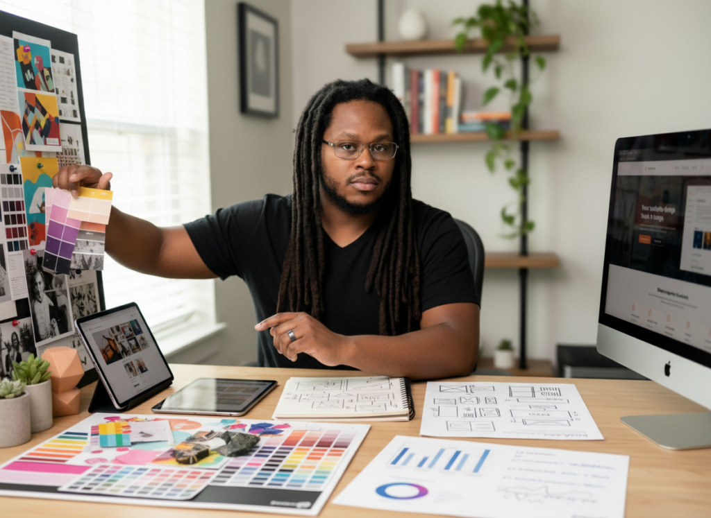
As a freelance brand designer in Houston, Texas, I’ve spent the better part of two decades watching businesses try to shortcut their way into becoming a “lifestyle brand.” They think that if they put their name on a piece of cotton, people will pay $30 to become a walking billboard for them.
Here’s the cold truth: Nobody wants to be your billboard. Especially not for a brand that hasn’t earned that level of loyalty yet.
If you want people to actually wear your gear: to choose it over their favorite vintage tee or high-end athletic wear: you have to stop thinking about “merchandise” and start thinking about “culture.” You have to move past the logo and start building a visual system that represents an identity.
The Logo is Just a Label
Let’s get one thing straight: Your logo is not your brand. Your logo is a shorthand: a visual anchor for everything your business represents. In the world of merchandise graphic design for brands, the logo is often the least interesting thing you can put on a shirt.
When someone buys a shirt from a brand like Deus Ex Machina or Patagonia, they aren’t just buying a logo. They’re buying into a lifestyle of grit, adventure, or environmental stewardship. The graphic on the shirt might not even include the full logo; it might be a custom illustration, a cryptic tagline, or a specific texture that signals “if you know, you know.”
For lifestyle brands like gyms and fitness studios, this is where the disconnect usually happens. You want your members to wear your gear outside the gym. You want them wearing it to the grocery store, the bar, or on a flight. But if the shirt screams “I WORK OUT AT THIS SPECIFIC CROSSFIT BOX,” most people are going to leave it in the gym bag.

The Confusion Tax on Your Merch
In my work, I often talk about The Confusion Tax. This is the price you pay when your messaging or your visuals are cluttered, unclear, or misaligned with your quality. When you slap a poorly scaled logo on a cheap shirt, you are charging a Confusion Tax. You’re telling the world that you don’t care about details, aesthetics, or the comfort of your community.
People feel this. They might not be able to articulate why they don’t like the shirt, but they know it feels “off.” It feels like “work gear” rather than “lifestyle gear.”
To avoid this tax, you need brand design for gyms and fitness studios (or breweries and shops) that understands the “Professional Rebel” aesthetic. It’s about being polished enough to be taken seriously, but raw enough to feel authentic. It’s about Punk Discipline: having the creative guts to break the rules of traditional corporate branding while maintaining the discipline of a cohesive design system.
Visual Identity as a System
The secret to gear that people actually wear is treated the visual identity as a system, not a single file.
When I’m building out branding for lifestyle brands, I don’t just give them a logo. I give them a toolkit. This includes:
- Secondary Marks: Smaller, more abstract icons that can be placed on sleeves, hems, or lockers.
- Custom Typography: Using specific fonts that convey the “vibe” of the brand without needing to spell the name out in 72pt bold.
- Texture and Treatment: Deciding if the brand is clean and modern or weathered and “street.”
- Color Palettes that Work in the Wild: Move beyond your primary brand colors. If your logo is neon green and orange, maybe don’t make the shirt neon green. Use muted tones, charcoal, or washed-out blacks that fit into a modern wardrobe.

Why Gyms and Breweries Fail at Merch
Gyms and breweries are the biggest offenders of the “Logo Dump.”
For a gym, the shirt should represent the result of the work. It should look like something a high-end athlete would wear. It should have a silhouette that actually fits a fit person. The design should be aspirational. If the design is just a heavy block of ink on a thick cotton tee, it’s going to be heavy, it’s going to hold sweat, and it’s going to look terrible after three washes.
For breweries, the shirt should represent the vibe of the taproom. If your brewery is a gritty, industrial space in East Houston, your shirts shouldn’t look like they were designed in Canva by an intern. They should have that same industrial, weathered, and intentional feel.
Stop thinking about what you want (your name in big letters) and start thinking about what they want (a shirt that makes them look and feel cool).
The Power of the “Drop” Mentality
Another mistake businesses make is keeping the same tired merch on the shelf for three years. If you want to build a culture, you have to create energy.
I advocate for the “Limited Drop” approach. Instead of one boring shirt, create a series of limited-edition designs. Work with a designer who can take your core brand elements and “remix” them. Maybe one drop is a vintage-inspired racing tee. Maybe the next is a minimalist, heavy-weight oversized hoodie with a tiny embroidered logo on the chest.
This creates a sense of exclusivity. It makes your brand collectible. When people see someone else wearing a “Drop 01” shirt from your gym or shop, it signals that they were part of the community from the beginning. That is how you build culture.
Designing for the “Wild”
When I’m sitting at my desk in Houston, working on a project, I’m always imagining the design in the wild. I’m not looking at it on a white background on my monitor; I’m imagining it under the flickering fluorescent lights of a boxing gym or the golden hour sun on a brewery patio.
The design needs to hold up in those environments. It needs to look good when it’s wrinkled. It needs to look good when it’s faded. In fact, a good lifestyle brand often looks better the more it’s worn.
This is why I lean into high-contrast, gritty aesthetics. 35mm film style photography isn’t just a trend; it’s a reflection of reality. It’s raw, it’s imperfect, and it’s human. Your merch should feel the same way.
Build Something Worth Wearing
If you’re ready to stop being a billboard and start being a brand, you have to invest in the design side of the business. You have to realize that your visual identity is the most powerful tool you have for building community.
Don’t settle for “good enough.” Don’t let the “Confusion Tax” eat your profits and your reputation. Whether you’re running a gym in the Heights or a coffee shop in Downtown, your gear should be a reflection of the hard work you’ve put into the business itself.
If you’re tired of seeing your shirts end up in the “sleep shirt” drawer or, worse, the Goodwill bin, it’s time for a change.
Ready to elevate your brand?
I’m Terrence, and I help brands move from “just a business” to a culture people want to be a part of. If you want a design system that actually works in the real world: not just on a screen: let’s talk.
You can reach out directly at info@sanicreative.com or request a brand audit to see where your current visual identity is holding you back. No fluff, no marketing hype: just high-impact design for brands that give a damn.