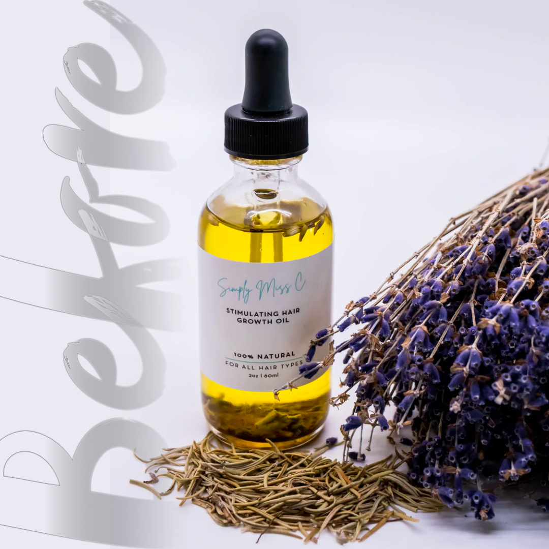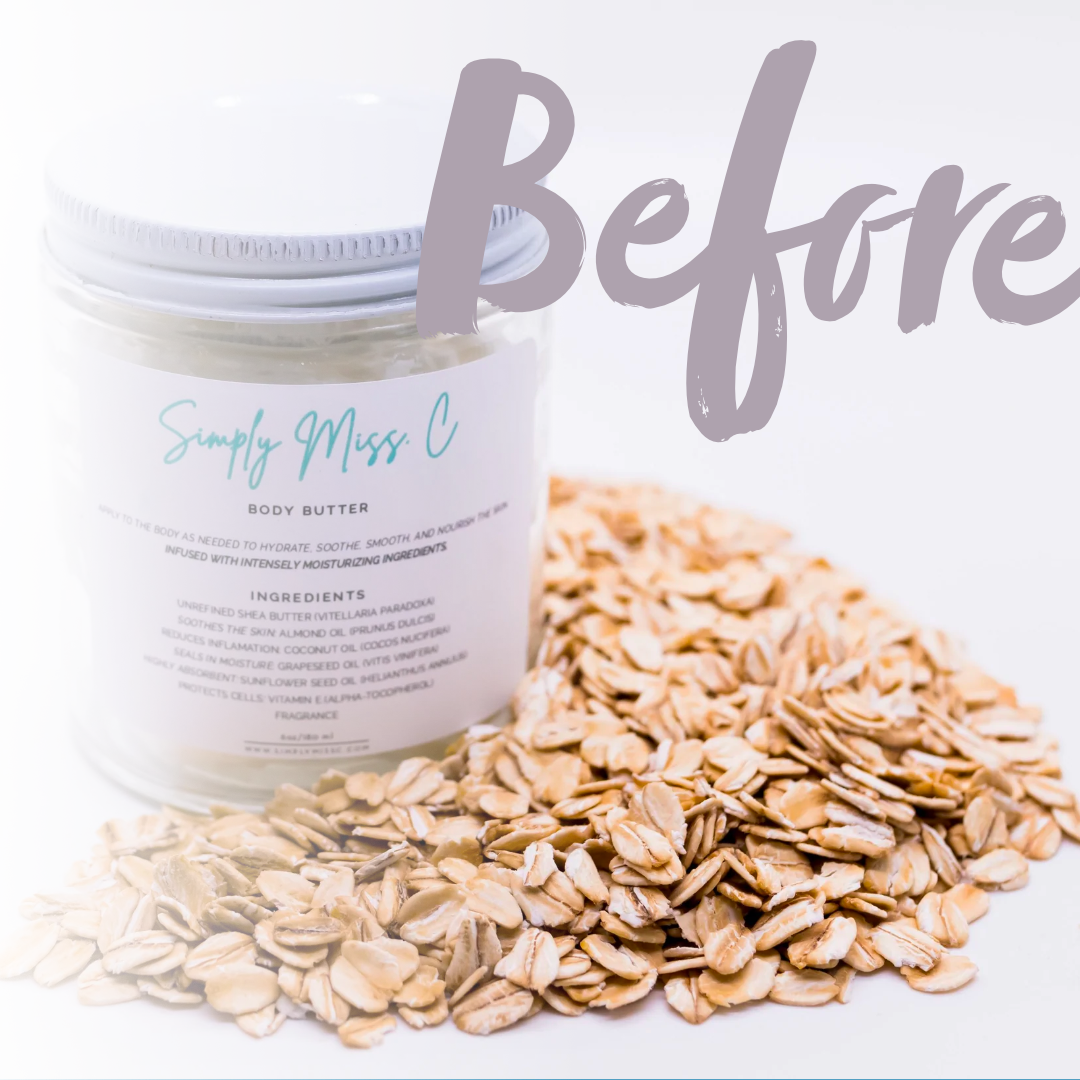
Simply Miss C came with a product line worth buying. The packaging needed to make sure people didn't walk past it first.
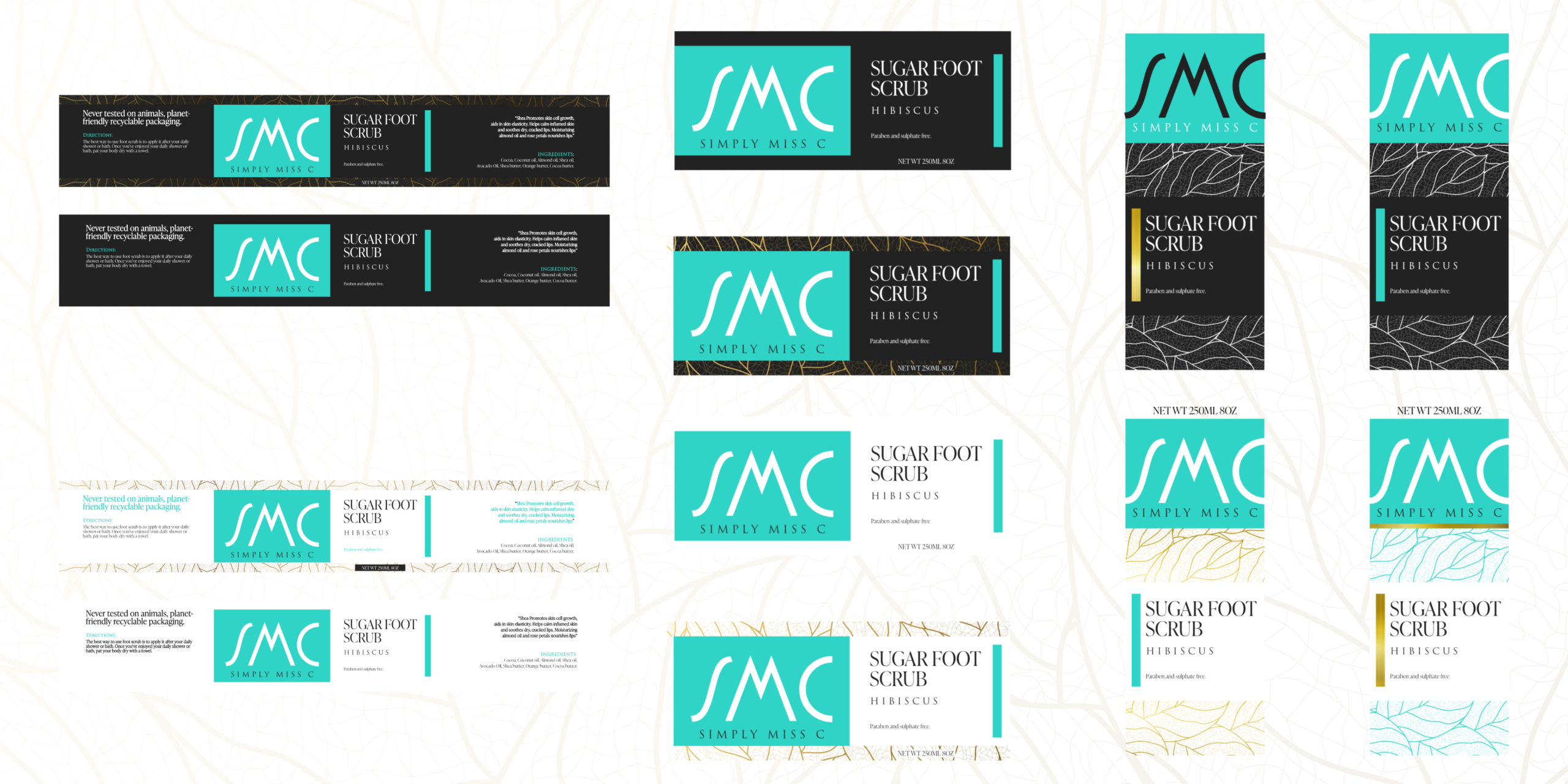 Sugar Foot Scrub — Full Label Variant System
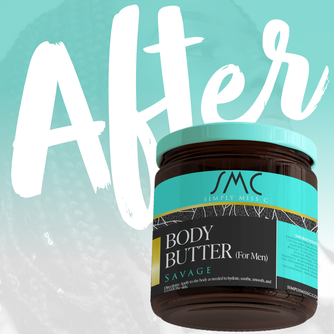
Simply Miss C is a clean beauty and personal care brand built around natural ingredients and a bold aesthetic. The product line spans foot care, scalp therapy, and body care — including a men's line. Every SKU needed to look like it belonged together, and every label needed to be good enough to sell the product before anyone read the ingredients.
Teal. Black. Gold. Botanical texture. Simple in principle. Demanding in execution.
Teal energy. Midnight black authority. Gold luxury. Three colors that communicate clean beauty without being generic about it. Every combination was tested against real product materials before anything went to print.
The SMC monogram lives in a teal brand block — script letterforms modern enough for a retail shelf and personal enough for an indie brand that means what it says. Clean, legible, and scalable to any container format.
White leaf patterns on dark backgrounds — texture that signals "natural" and "premium" without going crunchy. The pattern shifts across the product line to differentiate SKUs while keeping the family cohesive.
From a slim foot scrub wrap label to a wide-body jar to an amber dropper bottle — the design system flexes across every container format. Different shapes. Same visual language. That's the hard part. That's the work.
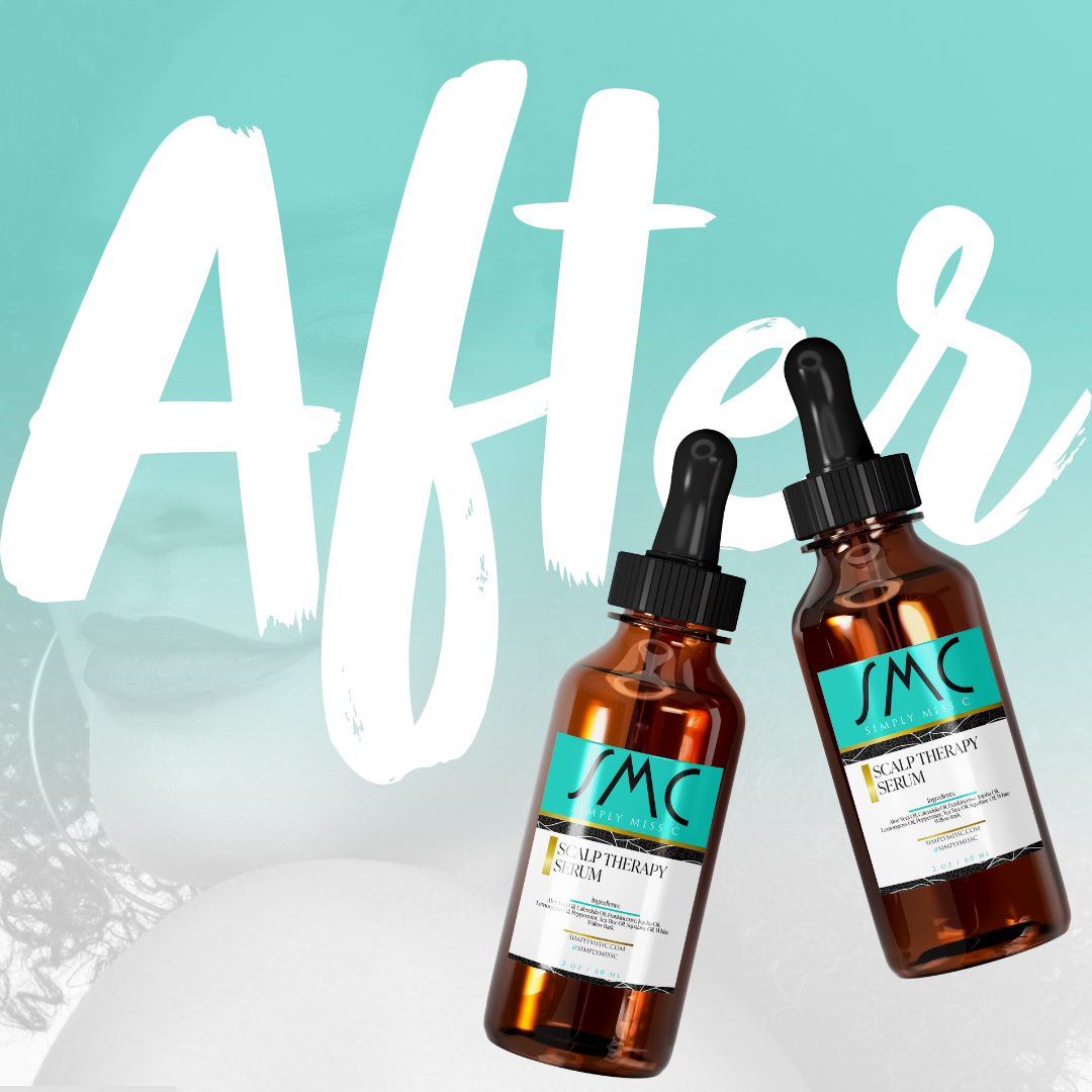
The teal and black contrast is unmistakable across retail shelving, e-commerce listings, and social media. Simply Miss C doesn't get scrolled past.
From foot scrub to scalp serum to men's body butter — every product reads as the same family without looking copy-pasted. That's a design system working correctly.
Print-ready files delivered across the full product line — specs built for real-world manufacturing, not just pretty mockups. The work ships.
No templates. No shortcuts. Just a brand built to stand.
Start with a Vibe Check