One Call.
Done Right.
A cleaning company needed a site that closed the sale before the phone even rang — transparent pricing, real reviews, and zero hesitation for a bilingual customer base.
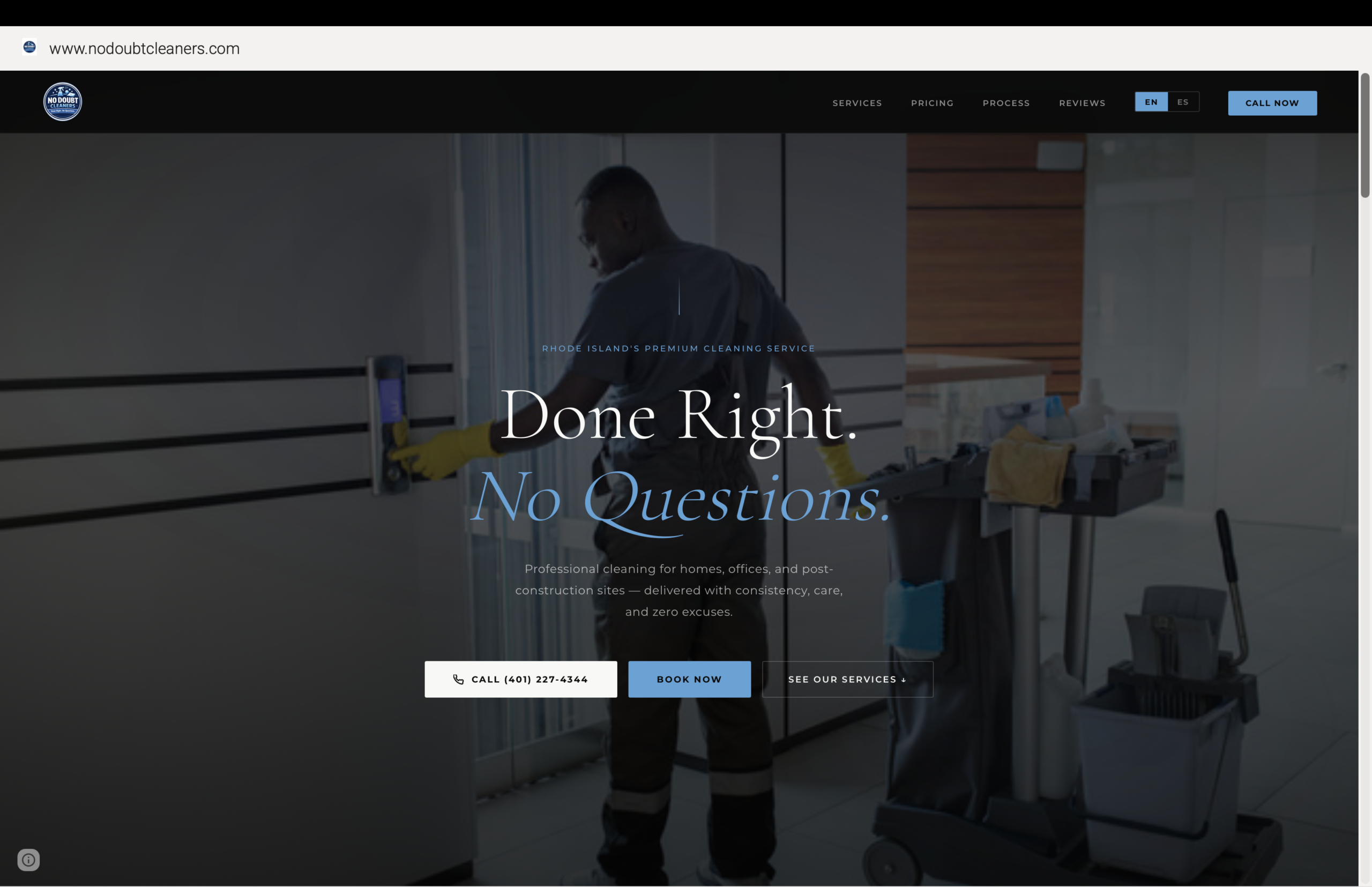
No Doubt Cleaners needed a site that could do the sales pitch on its own — before a single phone call. The brief: transparent pricing so nobody hesitates over hidden fees, a clear process so nobody wonders what happens next, and a bilingual experience that speaks to the full Rhode Island customer base. No guesswork, no vague quotes, no doubt.
This is what was built.
A full-bleed hero puts the crew at work front and center — no stock photography, no staged shots. Three CTAs above the fold cover every entry point: call now, book now, or scroll to see the services.
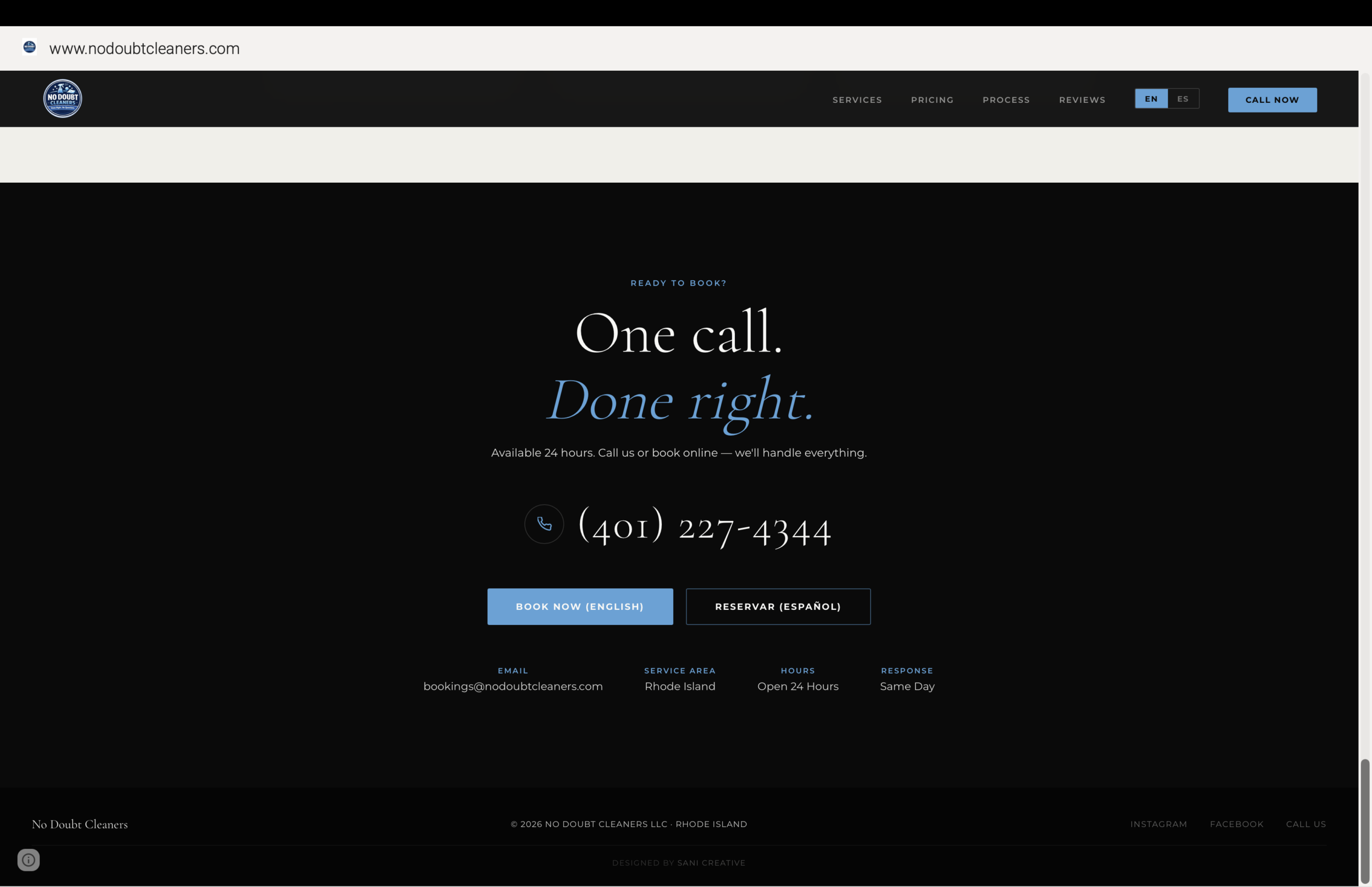
A before/after slider makes the value proposition visible instead of just claimed. Six service categories cover every job type the company handles — each with its own direct booking path, so nobody has to hunt for the right form.
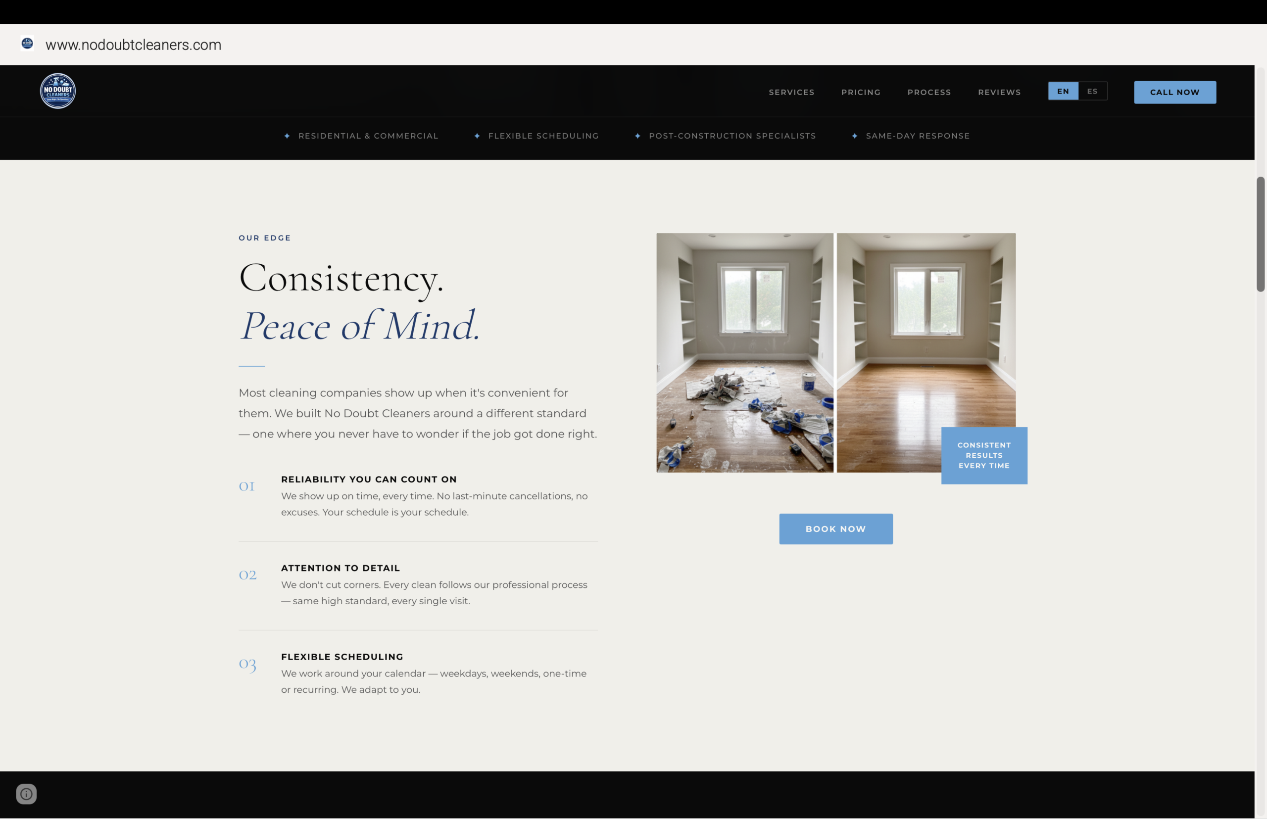
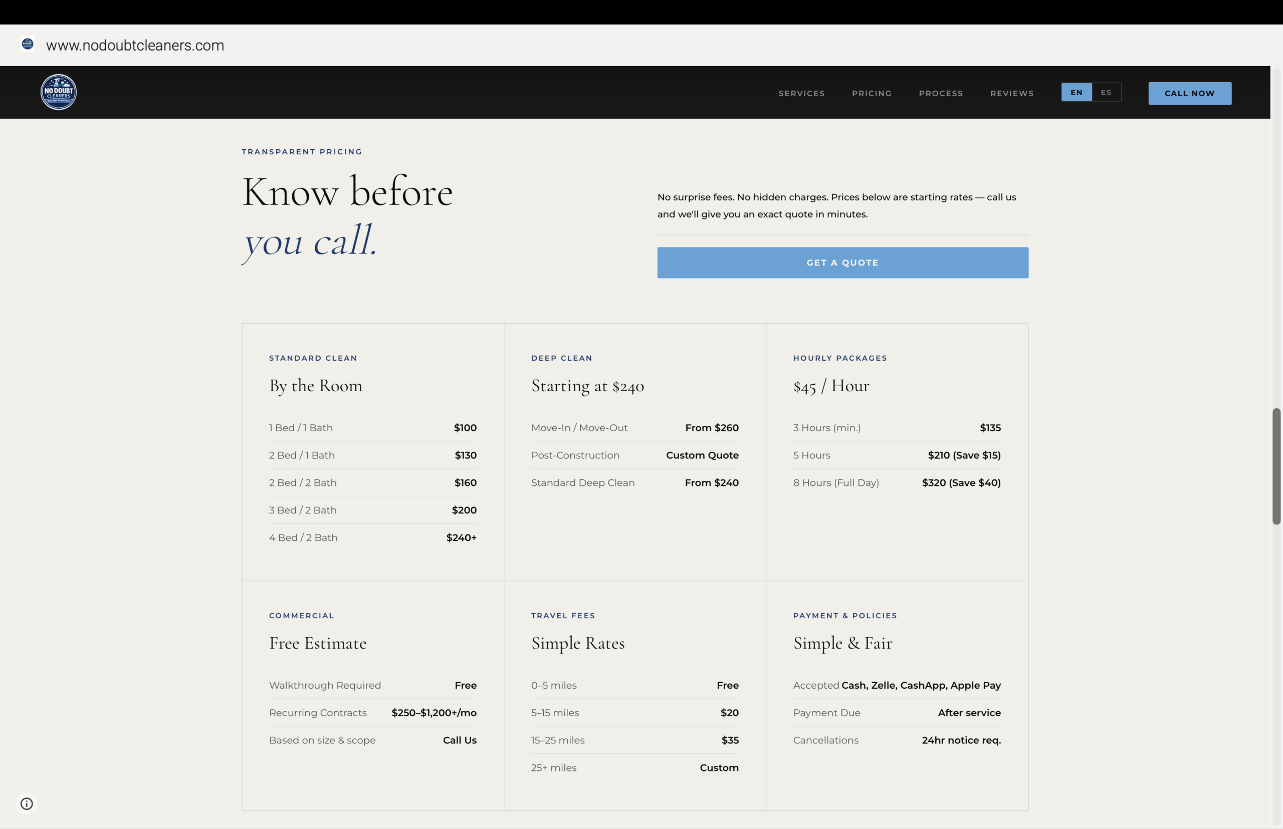
Pricing pages are where most service businesses lose trust — vague ranges, "call for quote" walls, hidden fees. This one does the opposite: every rate is visible, every fee is listed, and the CTA to book sits right where the hesitation would happen.
Every price, every fee, every policy listed in plain sight. No "call for a quote" wall standing between the visitor and a decision.
EN/ES toggle built into the header, not buried in a footer link — because half the customer base shouldn't feel like an afterthought.
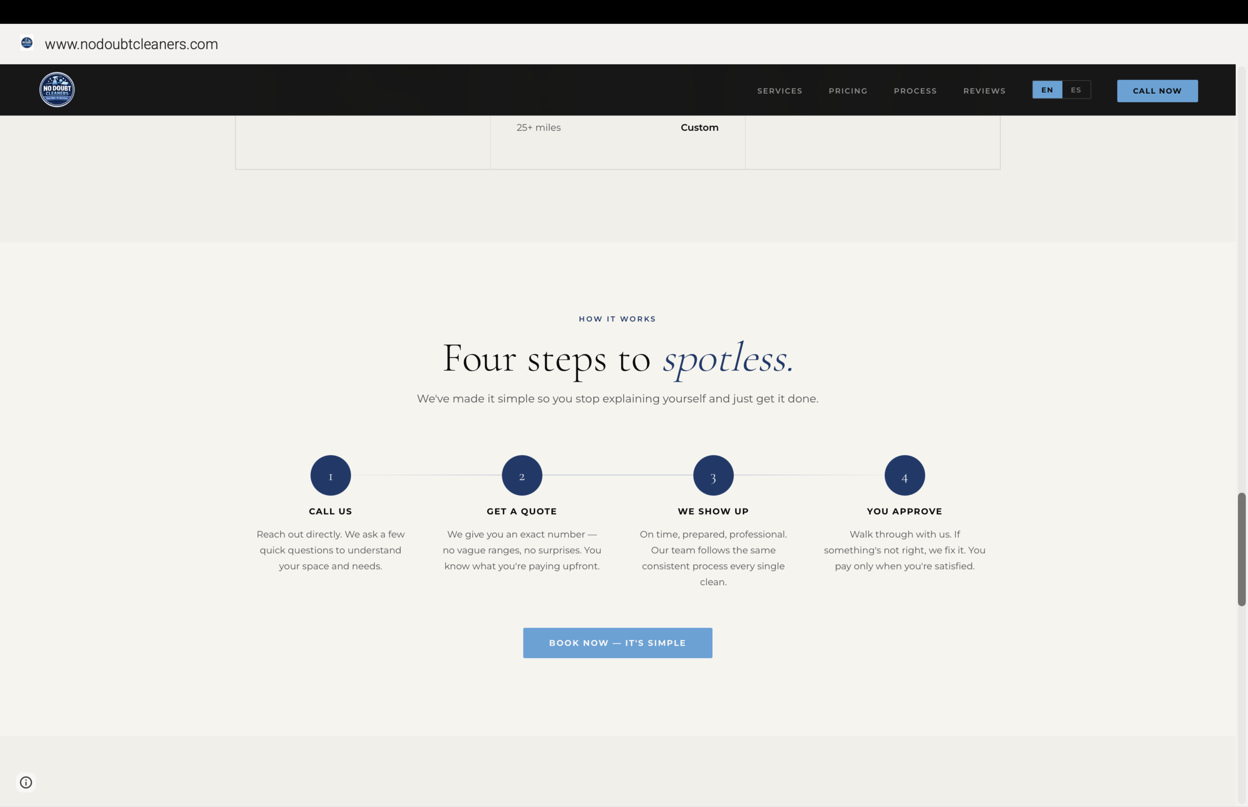
A four-step "how it works" section replaces sales language with a literal walkthrough — call, quote, show up, approve.
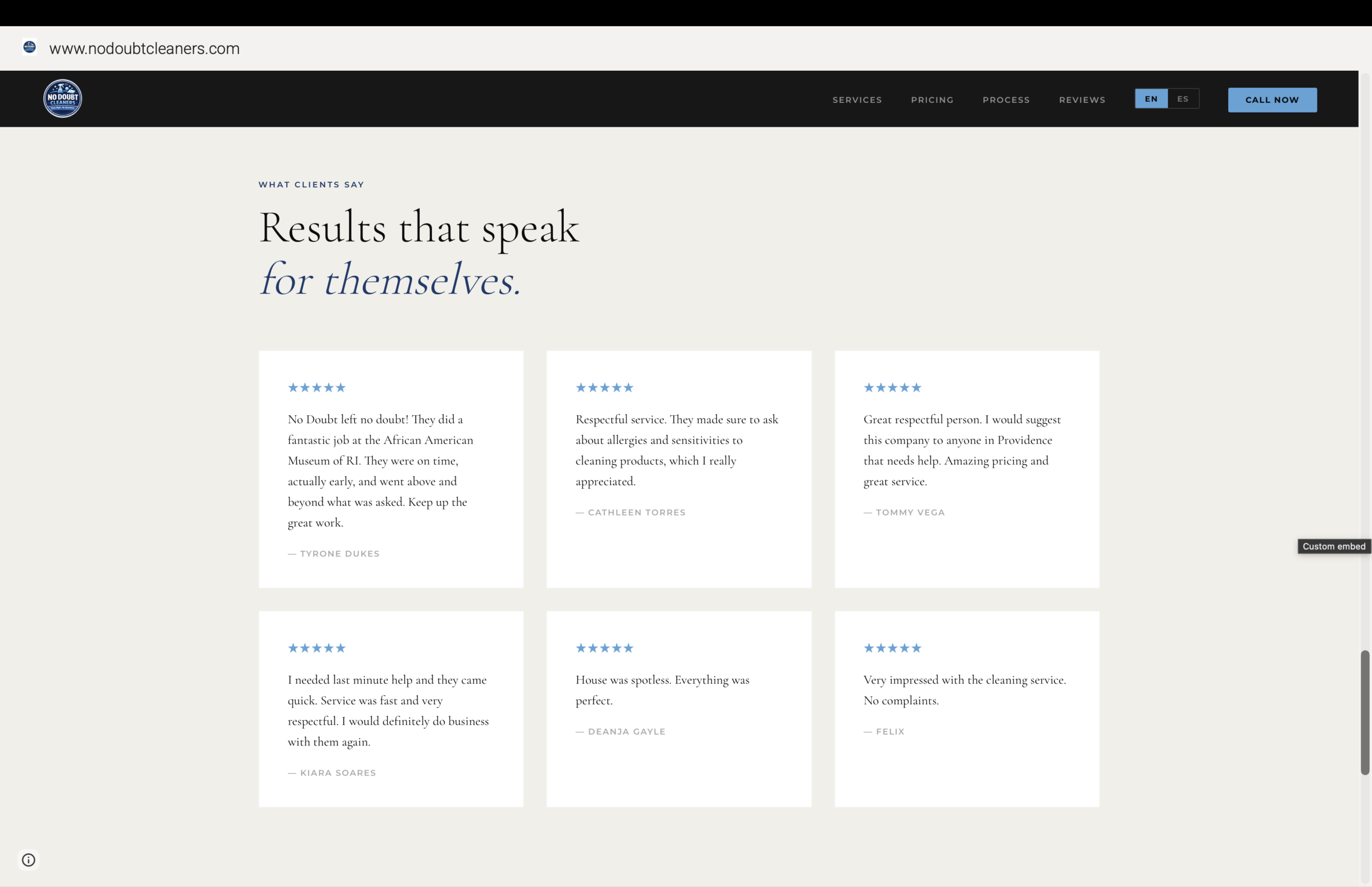
Real client names, real five-star reviews, laid out like testimony instead of a marketing carousel.
"If the pricing page makes people hesitate, it's not doing its job."
— Terrence Sani, Sani Creative
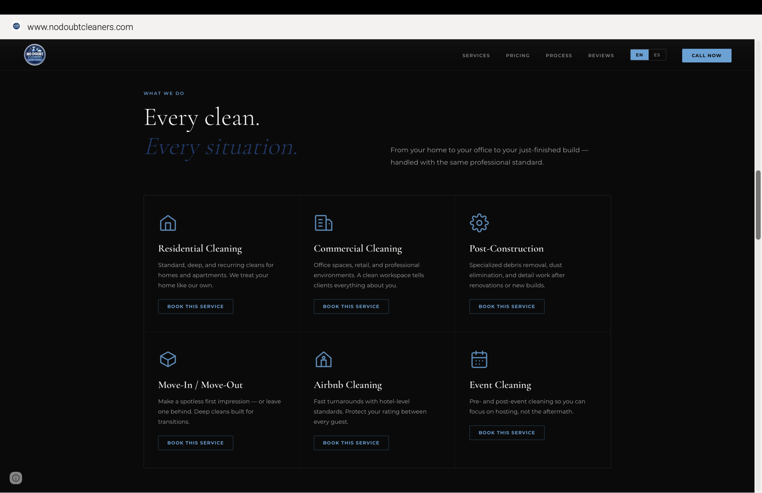
A simple four-step process removes any uncertainty about what happens after the call. Client reviews back it up immediately after — real names, real jobs, five stars across the board.
A Site That Closes
Before the Phone Rings.
Every rate published upfront — the site does the trust-building work a sales call usually has to do.
EN/ES toggle site-wide means the full Rhode Island customer base gets the same experience, not a second-tier one.
Call, book online, or scroll to services — every visitor converts on their own terms, not a single forced funnel.
Let's Build Something
That Lasts.
No templates. No shortcuts. Just work built to stand.
Start with a Vibe Check
Brand identities, packaging, and websites for businesses that give a damn how they show up.
