
Chef Byron cooks with intention. The brand needed to say the same thing before the first bite.
Chef Byron is a culinary entrepreneur building a brand around quality, authenticity, and bold food. He needed a visual identity that conveyed all three — something that felt both modern and established. The solution was a stamp-style logo system. A mark that says 'approved,' 'certified,' and 'worth your time' before a single word of copy does. Bold typography. A persona built around the 'Foodie Family' audience. Merchandise that people actually want to wear.
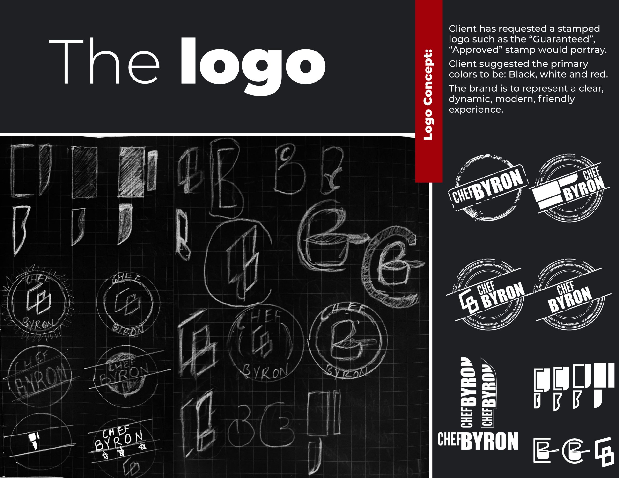
Stamp-style variations that echo 'approved' and 'guaranteed.' A mark that carries the weight of quality without saying a word.
Bold, dynamic letterforms. Modern strength with accessibility — the kind of type that reads at a glance and sticks in memory.
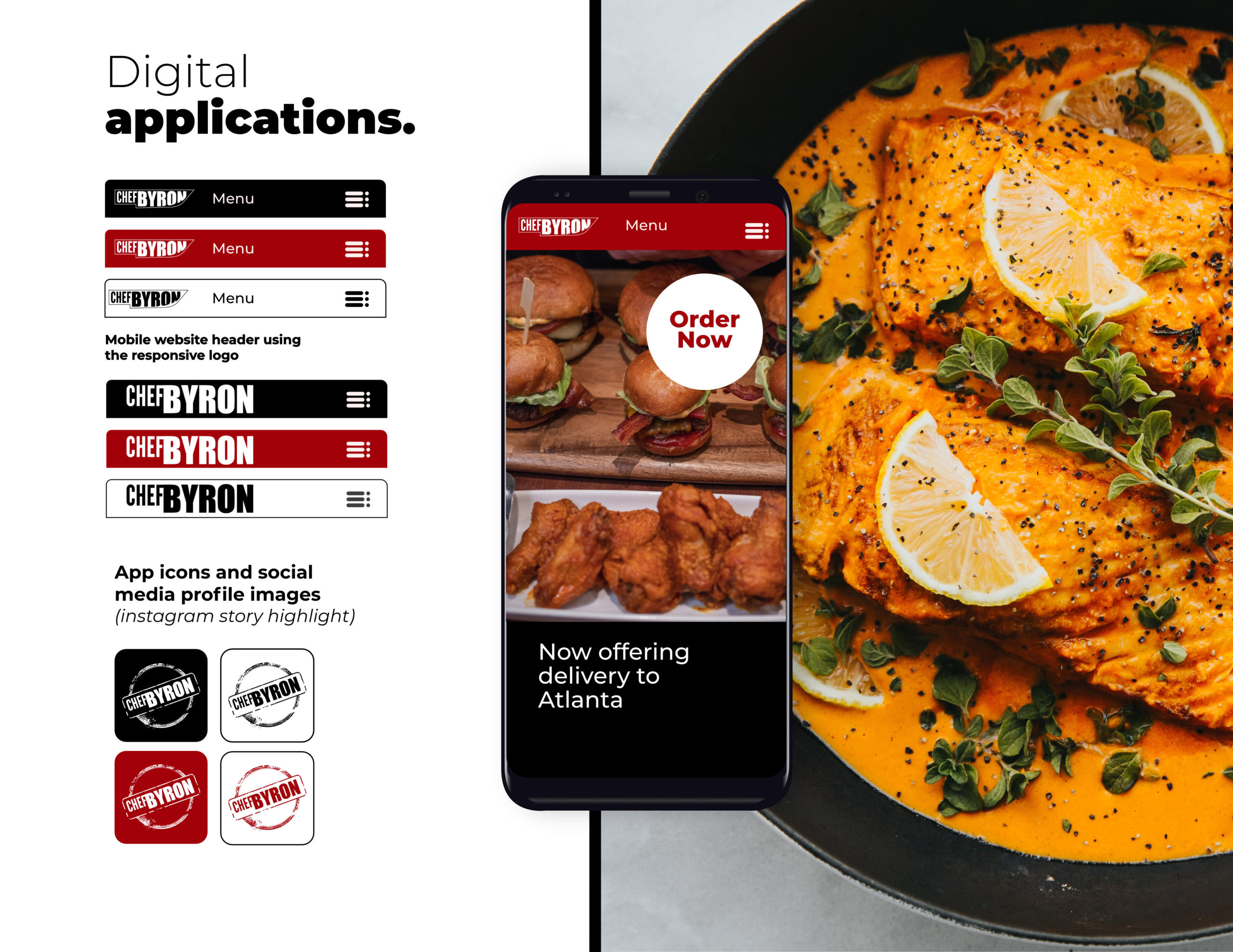
Responsive headers, app icons, social media profiles — all built from the same mark so the brand is unmistakable everywhere.
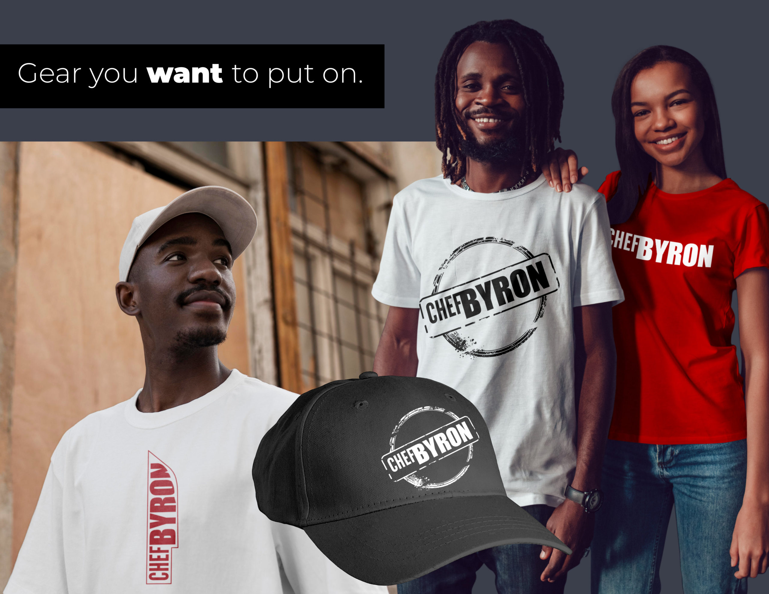
The logo is the product. T-shirts and caps where the mark carries the piece — and fans carry the brand.
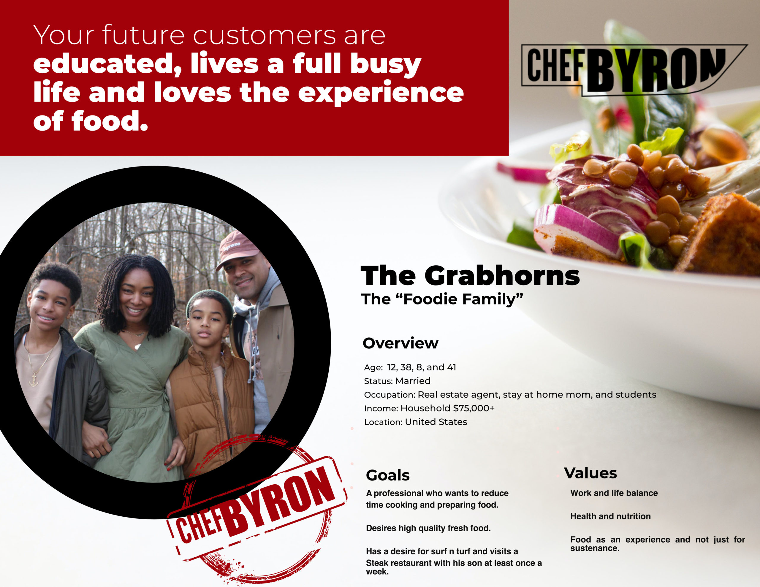
Before a single logo mark was drawn, we developed a detailed client avatar for Chef Byron — household income, family structure, profession, values, and what they're actually looking for when they search for a culinary brand. This is how you build a brand that speaks to exactly the right people.
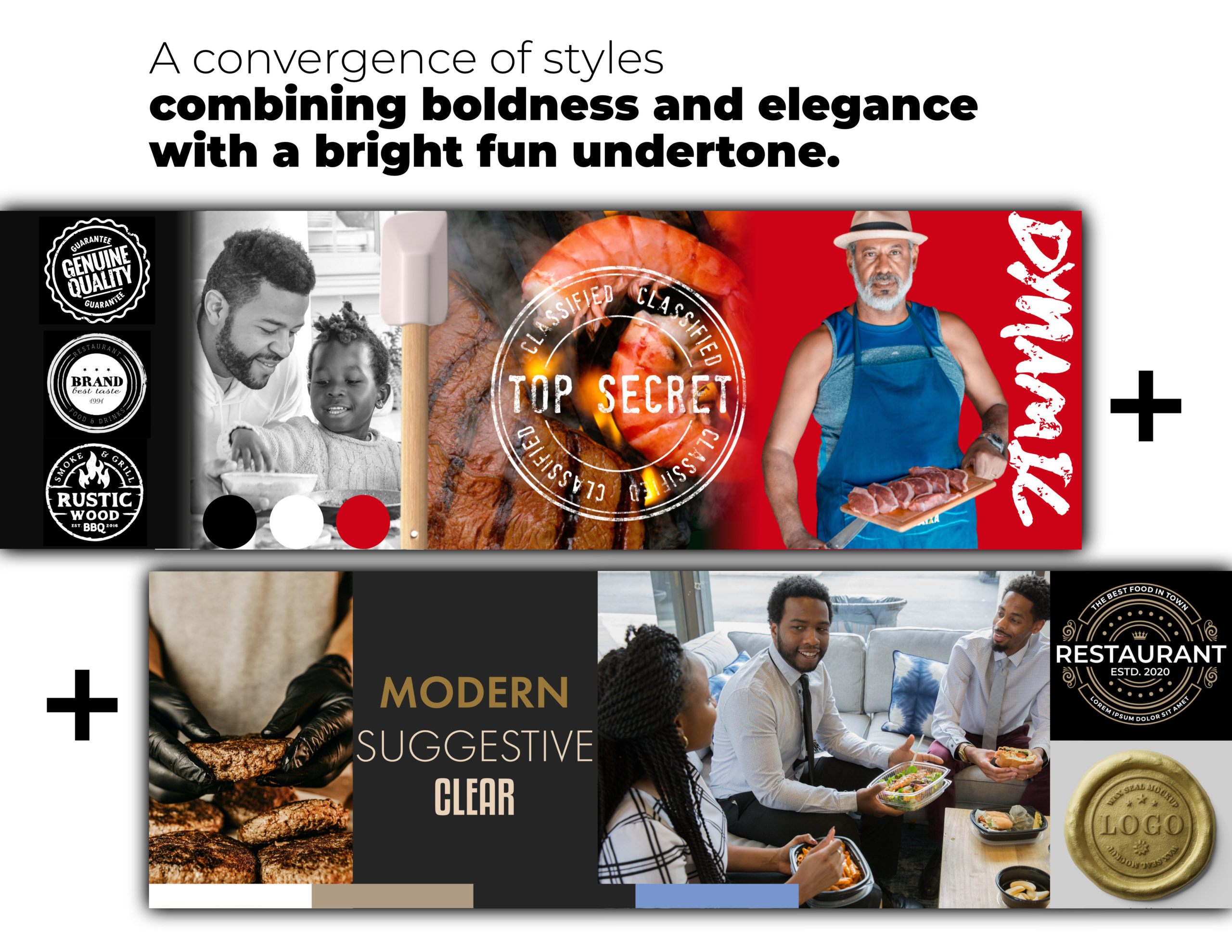
Before the logo was designed, the mood was built. A style scape brings together photography, typography, color, and texture to establish the visual language of a brand before a single vector is drawn. This is what informed the stamp-style mark Chef Byron carries today.
The stamp-style logo is immediately recognizable and conveys quality — exactly what Chef Byron needed to stand out in a crowded culinary space.
Cohesive digital assets across social media, mobile, and web create a unified presence that feels established from day one.
Branded apparel gives fans a way to connect with the brand and extend its reach far beyond the kitchen.
Your brand has a story. Let's tell it right.
Start with a Vibe Check