A State Representative candidate needed a campaign site that looked like a war chest, not a rush job. One page. One week. Zero shortcuts.
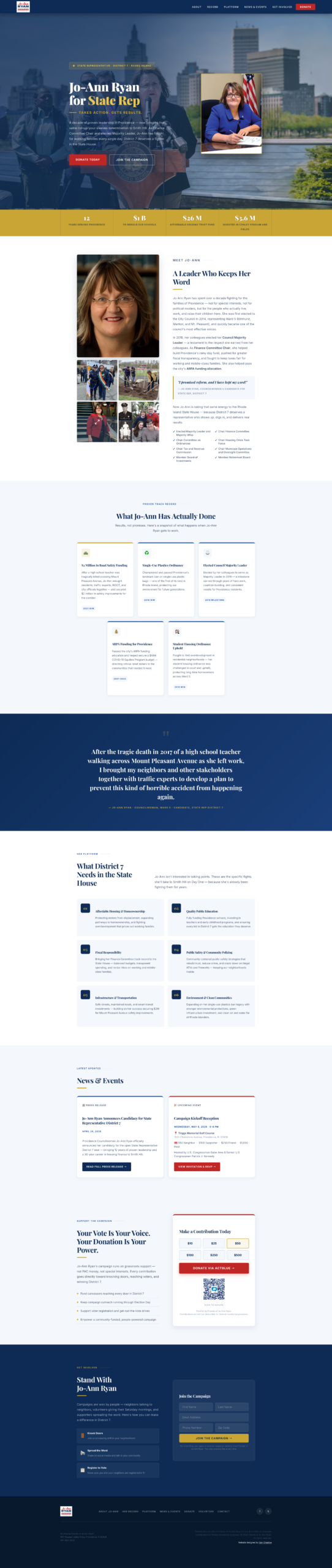
Jo-Ann Ryan was running for State Representative, District 7 in a competitive Providence race and needed a campaign site live — fast. No time for a drawn-out build process. The brief: one landing page carrying the full weight of a campaign. Bio, record, platform, donations, volunteer sign-up, press. All of it, on one scroll, in under a week.
This is what was built.
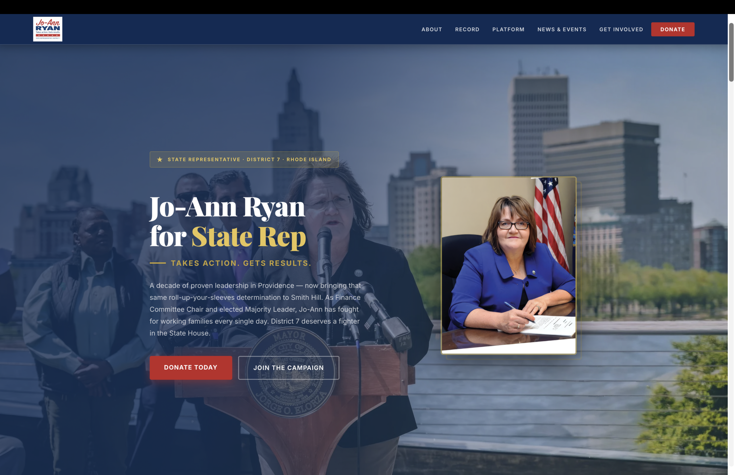
Navy, gold, and red signal political legitimacy from the first scroll. A dual CTA above the fold puts donating and joining the campaign in front of every visitor immediately — no scrolling required to act.
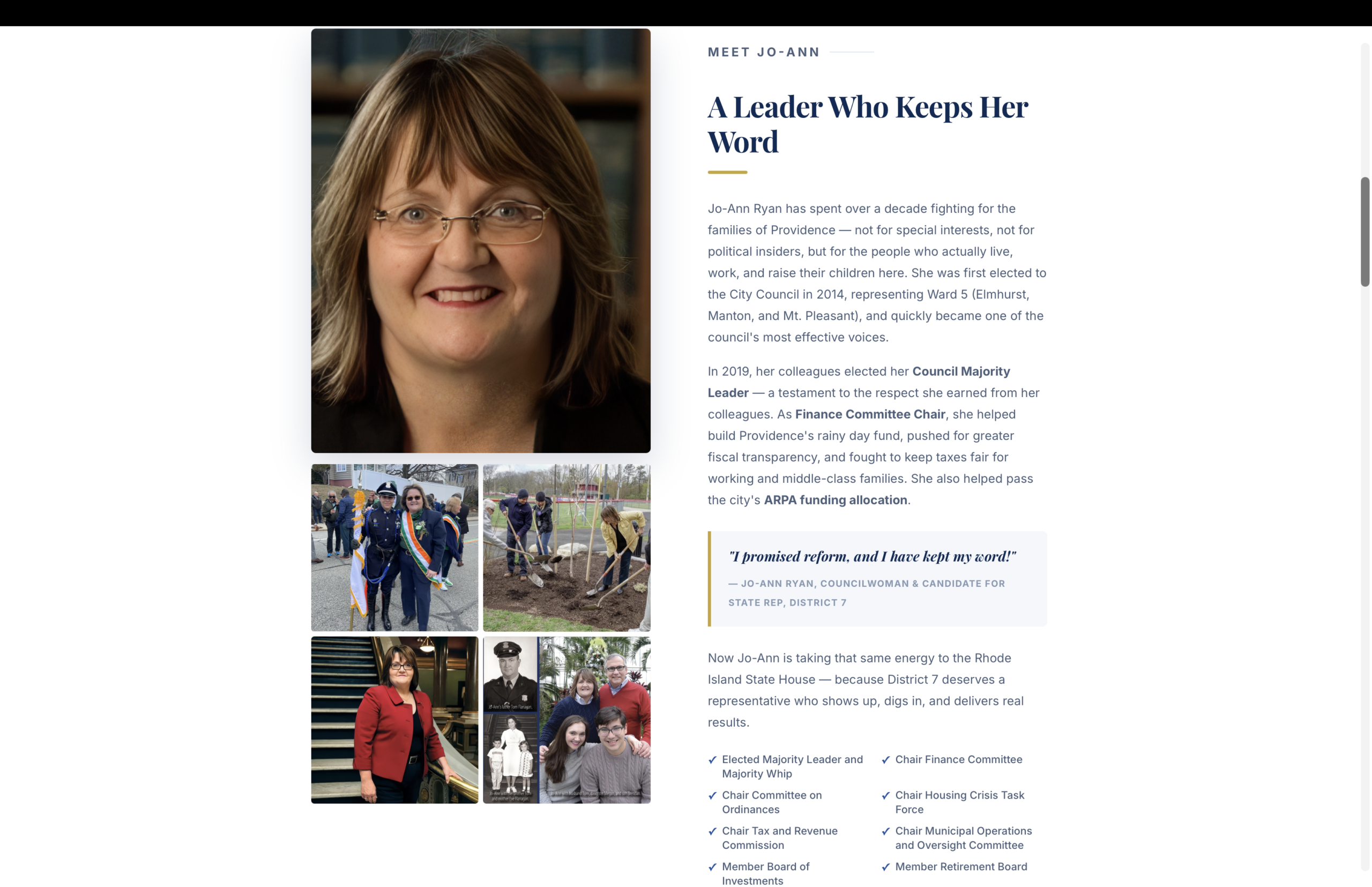
A dedicated track record section turns "trust me" into a receipts section — real dates, real wins, real dollar figures. The bio section pairs a professional headshot with a personal photo grid to keep the page human, not just political.
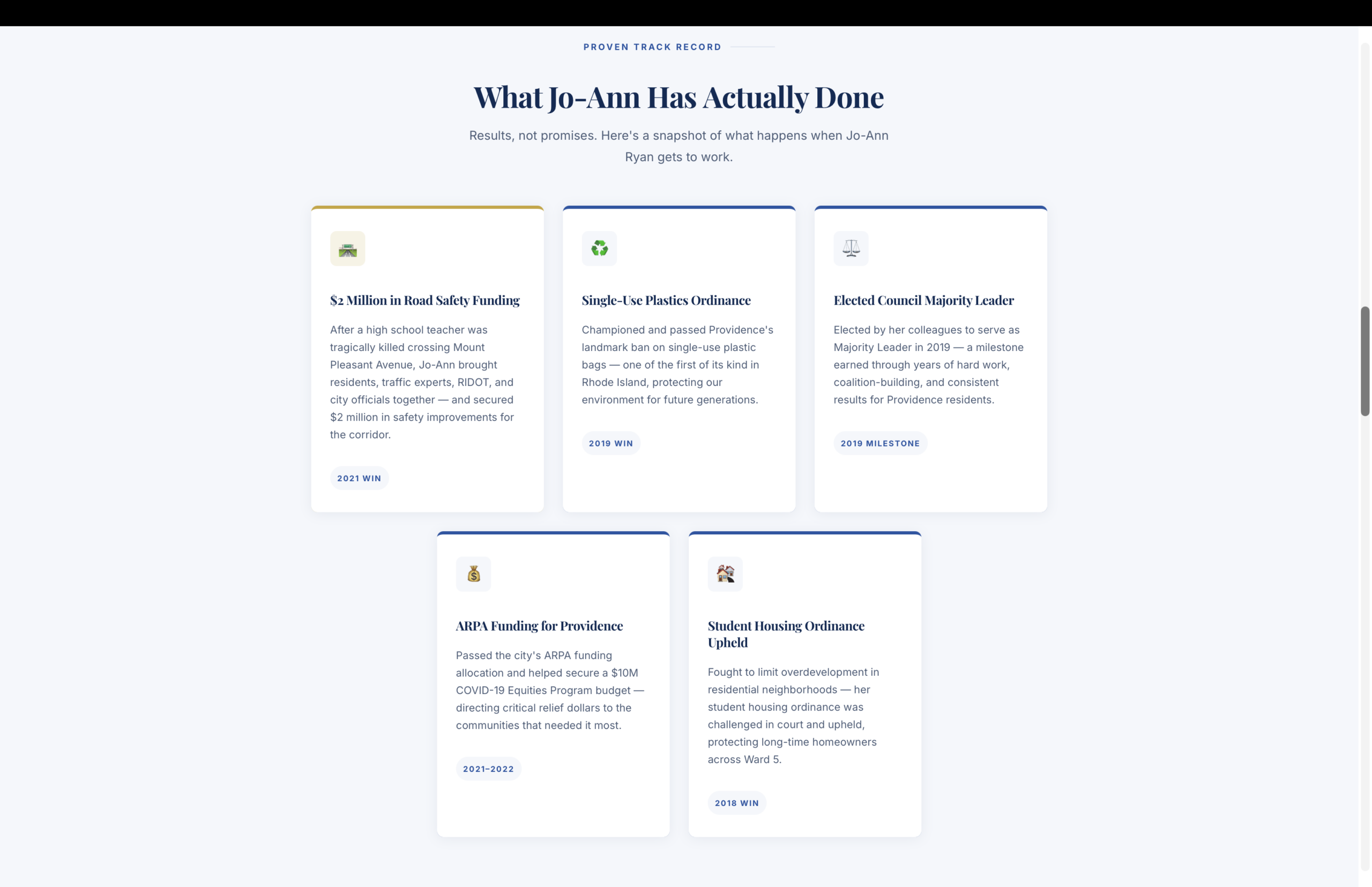
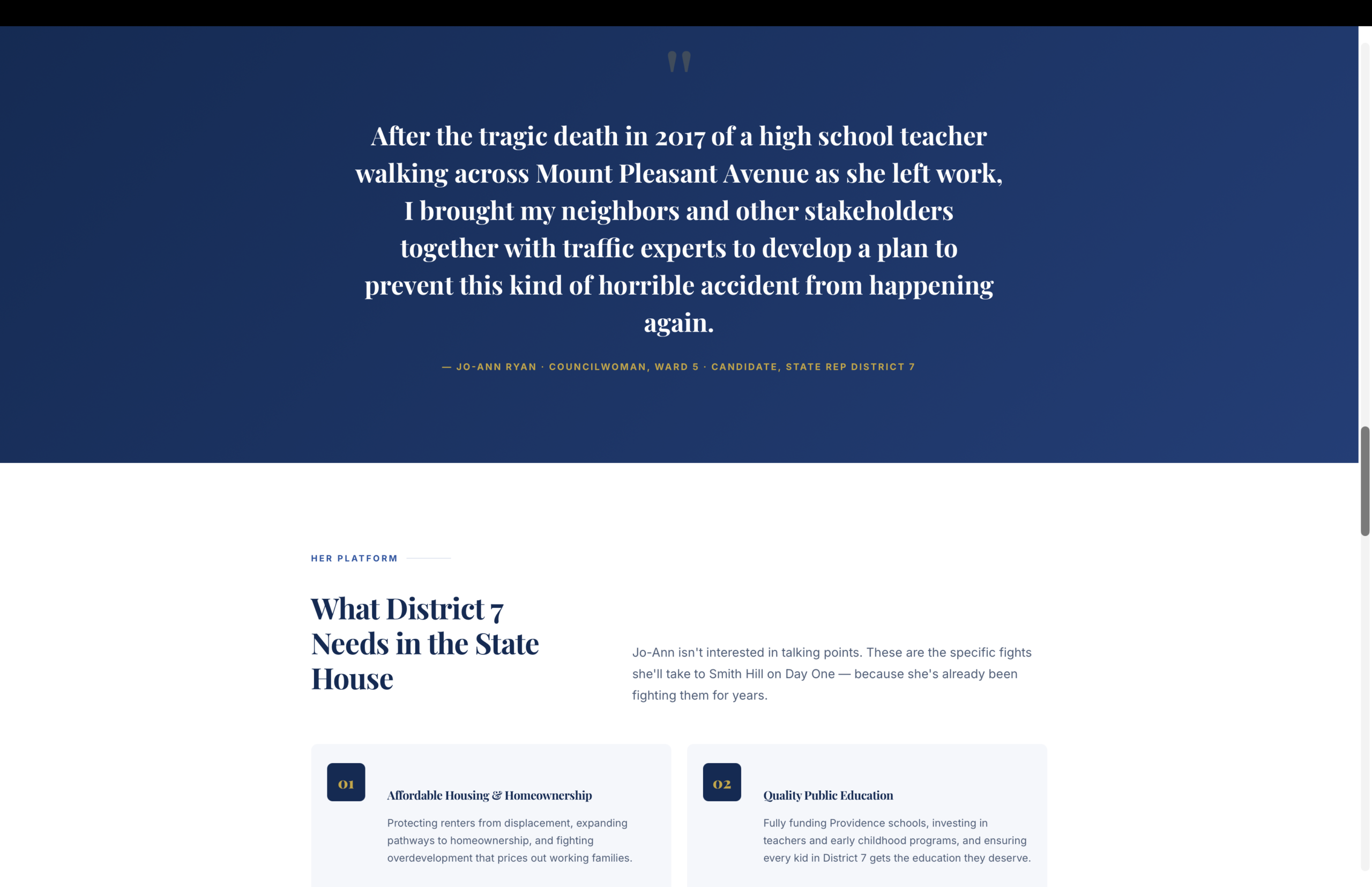
Every section was built modular so the whole site could ship in days, not weeks, without looking rushed. The layout carries a real campaign's full weight — bio, record, platform, press, donations, volunteer capture — without ever feeling crowded.
Navy, gold, and red signal trust and political legitimacy from the first scroll — no hesitation, no guessing what this site is for.
Modular sections built to ship fast without cutting corners — proof that quick doesn't have to mean cheap.
Donation tiers and volunteer forms placed for maximum action — not buried three clicks deep in a menu.
A dedicated track record section turns "trust me" into a receipts section, backed by real dates and dollar figures.
"A campaign doesn't get a slow rollout. You build it right, or you build it late."
— Terrence Sani, Sani Creative
Press updates and donation tiers sit side by side so credibility and action never compete for attention. A QR code puts mobile donations one scan away — built for a rally, not just a browser tab.
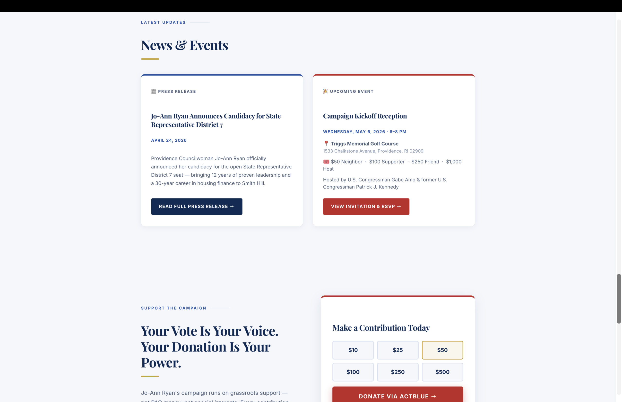
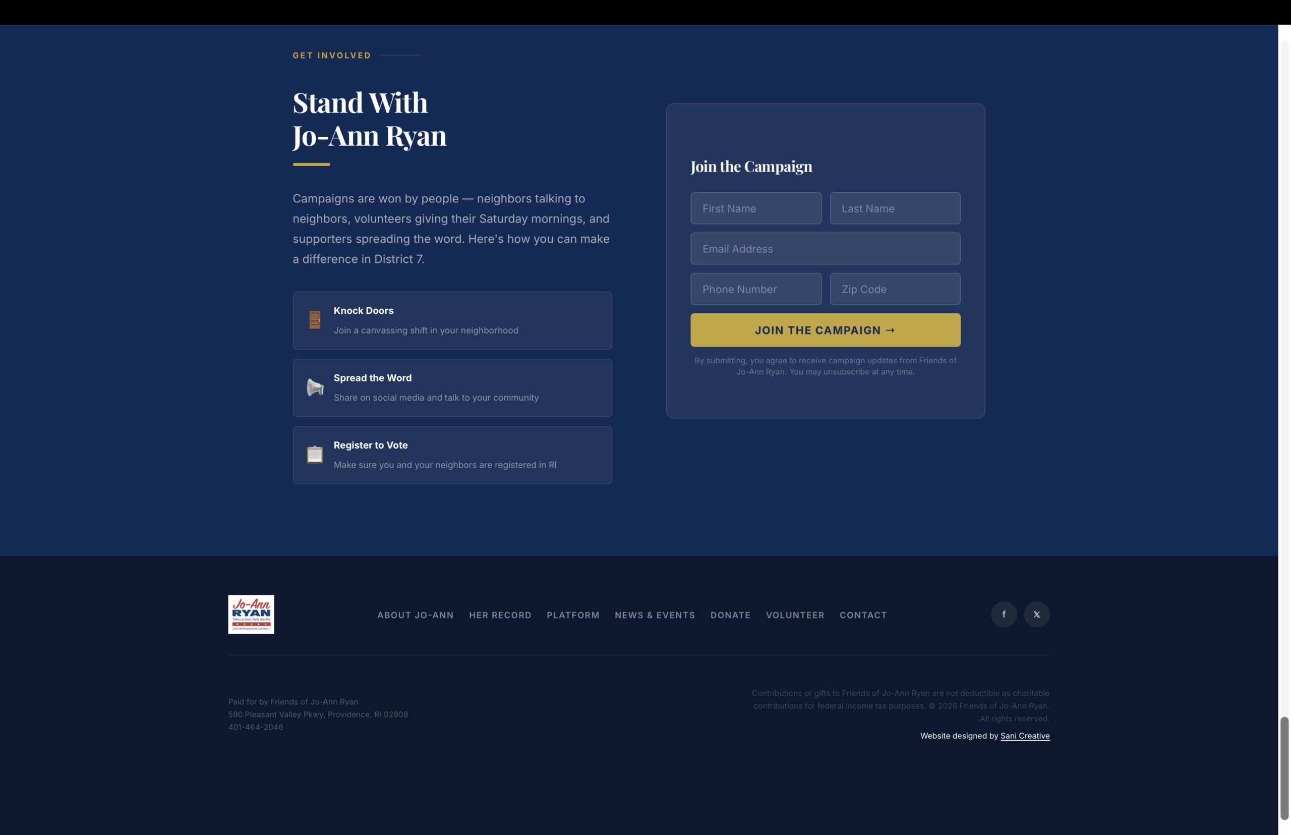
Full campaign site, donation platform, and volunteer capture built and launched on a real deadline — no shortcuts.
Every core function of a traditional multi-page campaign site condensed into a single high-converting scroll.
Site launched supporting a real State House run, built to convert visitors into donors and volunteers on day one.
No templates. No shortcuts. Just work built to stand.
Start with a Vibe Check
Brand identities, packaging, and websites for businesses that give a damn how they show up.
