Milwhite has been delivering science-backed mineral solutions since 1923. One hundred years of credibility — and a website and logo that finally say so.
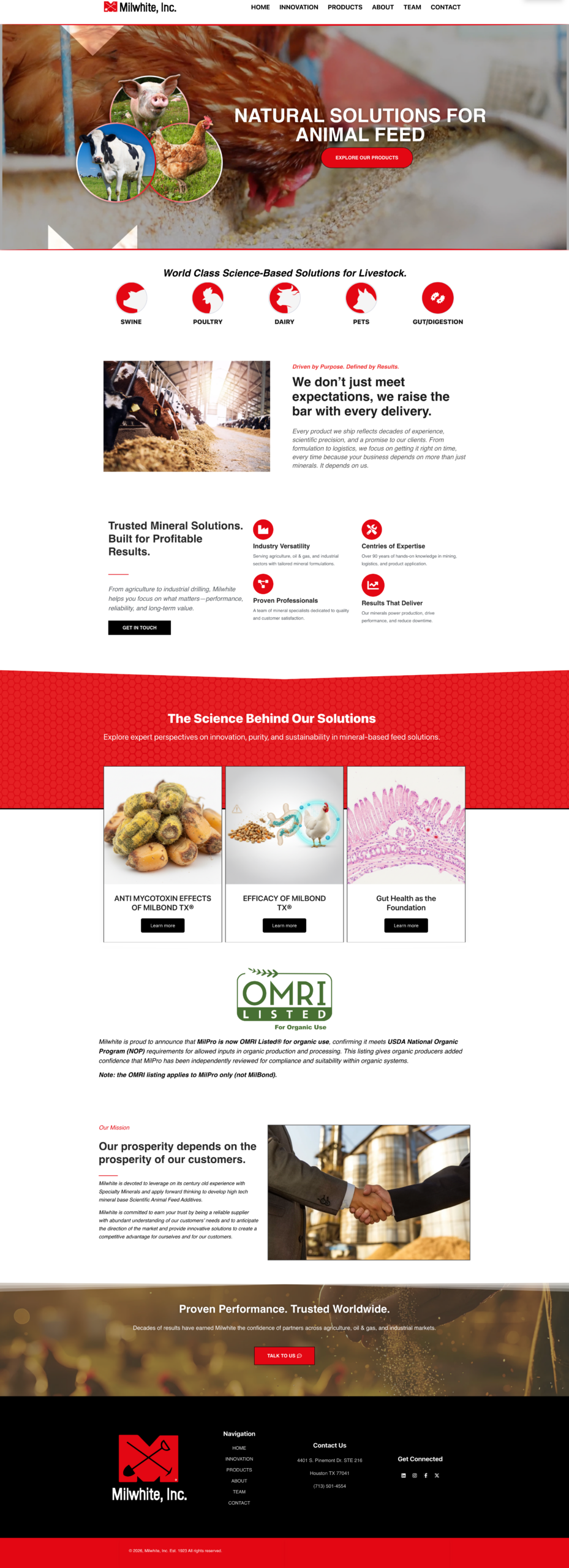
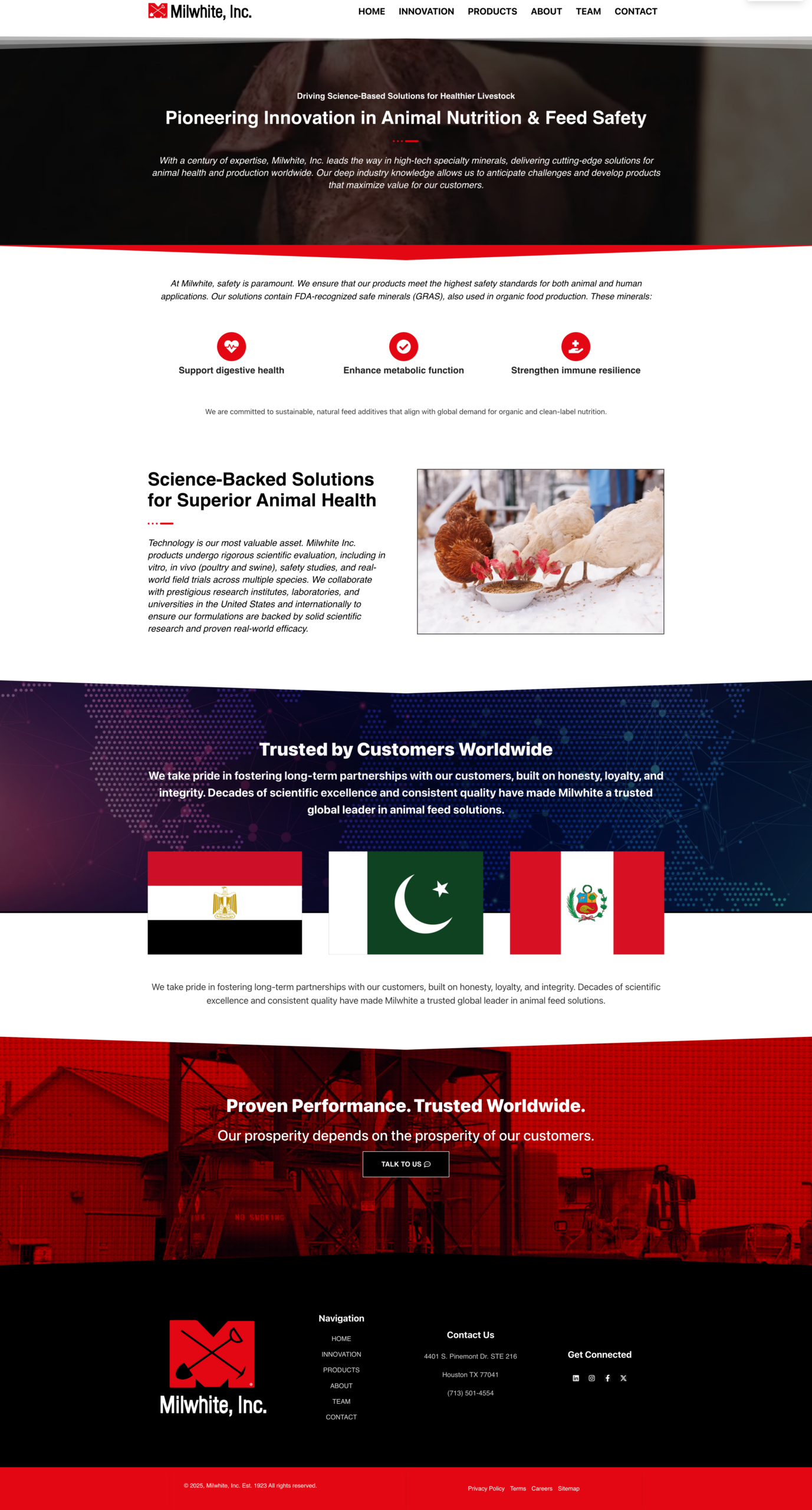
Milwhite, Inc. has been a leader in specialty minerals and animal feed solutions since 1923. They serve agriculture, oil & gas, and industrial markets worldwide — with products trusted by swine operations, poultry farms, dairy producers, and beyond. A company with that kind of history deserves a digital presence that carries the weight of it.
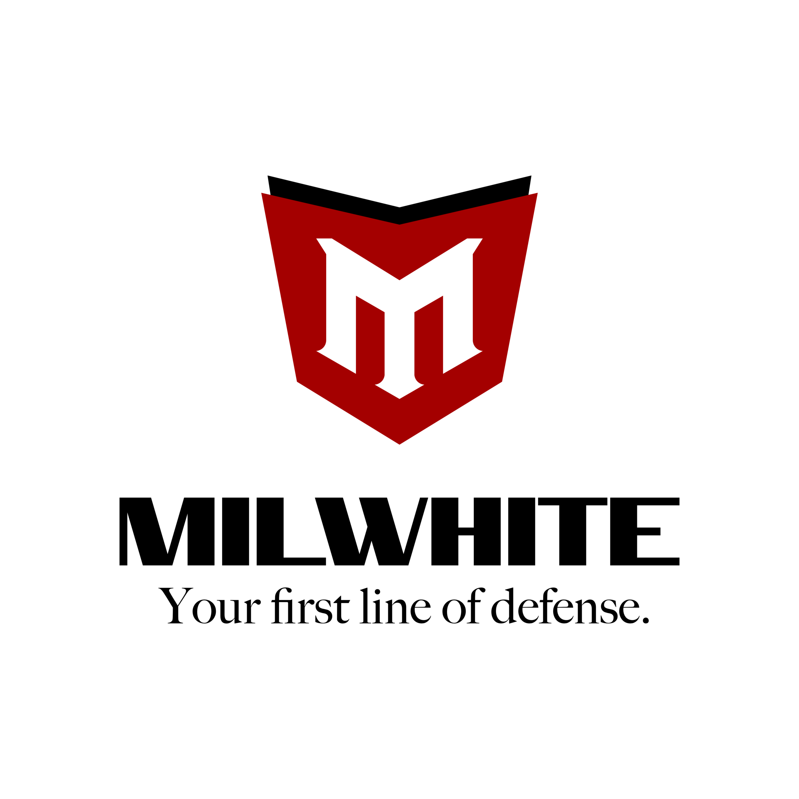
The scope: design the entire website from scratch, and evolve the brand mark from an outdated icon into a logo that commands the room.
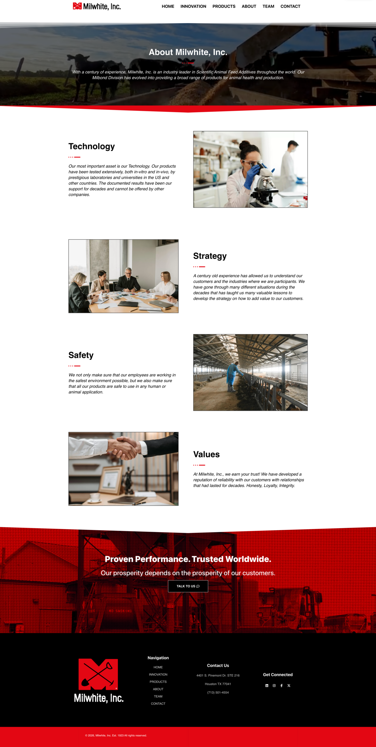
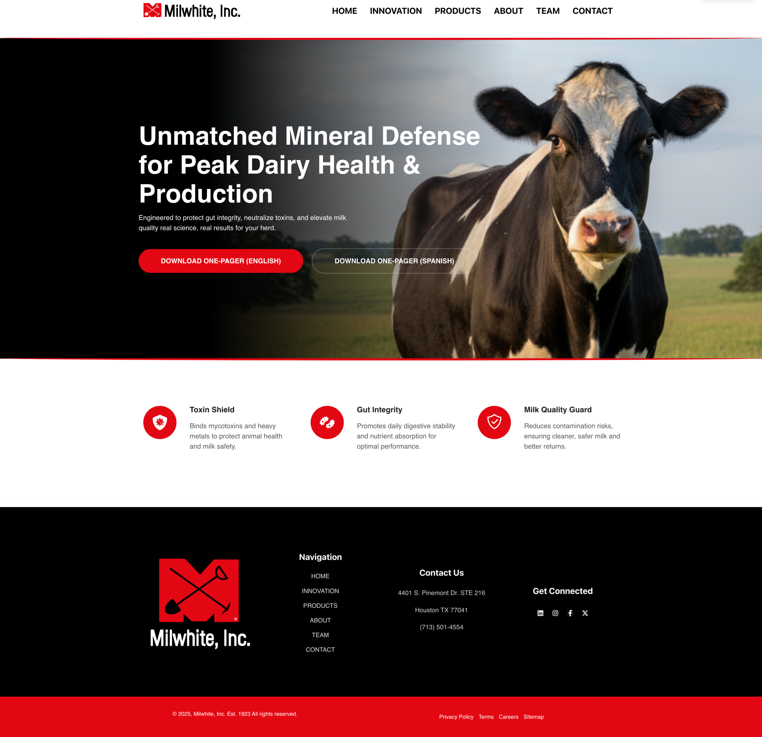
Milwhite's credibility comes from 100 years of results. Every design decision — typography, layout, color — was made to feel established and serious. This isn't a startup. The site doesn't look like one.
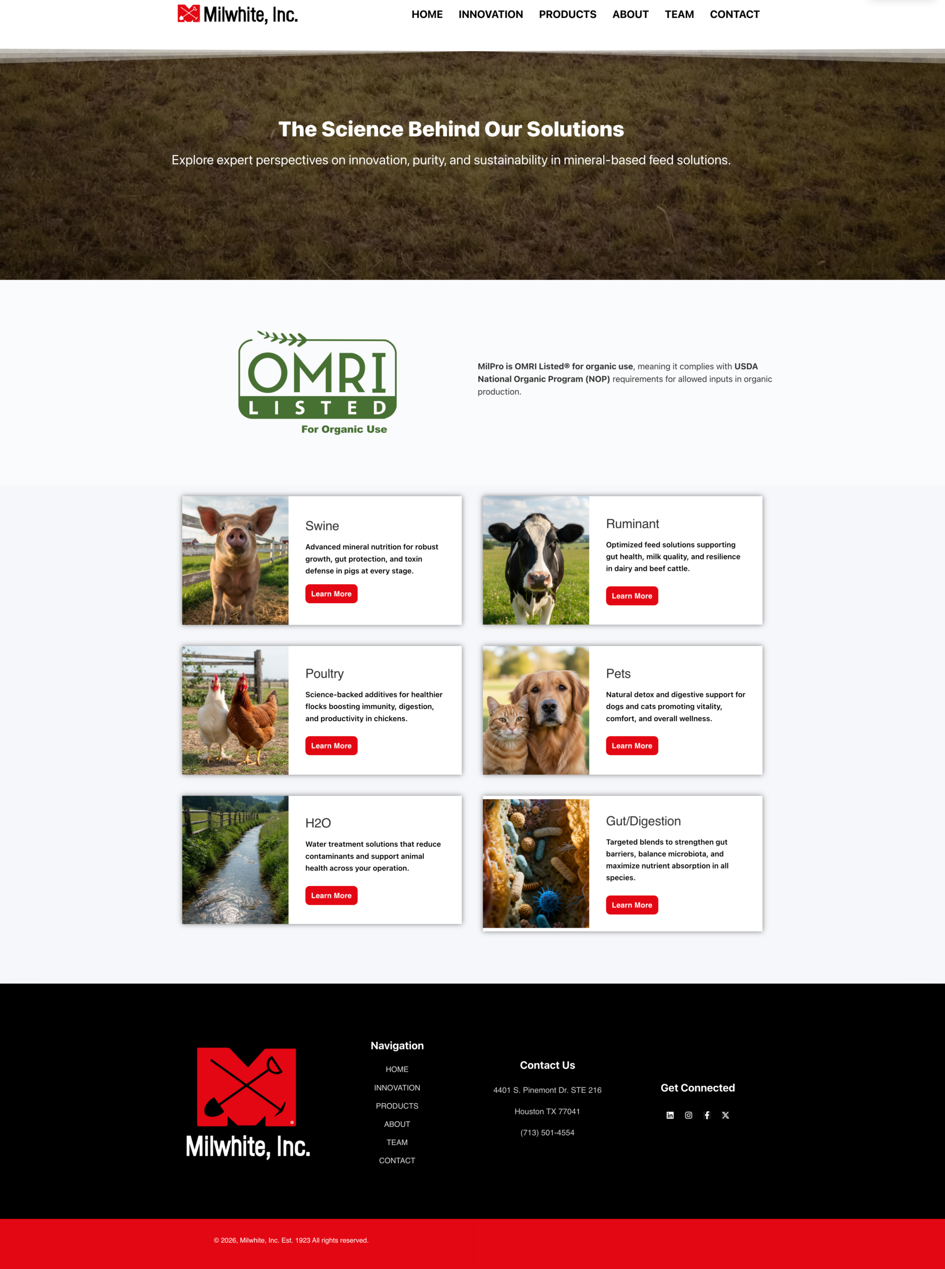
The product pages go deep — swine, poultry, dairy, pets, gut health, water treatment. Each page speaks to a specific buyer with specific needs. Structure that shows expertise, not just categories.
Milwhite operates internationally. The site was built with multi-language support across 12 languages — because "Proven Performance. Trusted Worldwide." has to mean something beyond the homepage copy.
Home. About. Innovation. Team. Contact. 6 product categories. Science articles. Every single page was designed — not templated. The details on page 14 matter as much as page 1.
Milwhite's website now reflects the company's actual standing in the industry — a century of expertise made visible and credible from the first page load.
The new shield mark brings Milwhite's identity into alignment with its reputation. A logo that commands respect before anyone reads a single product description.
With 12 languages and a mobile-first build across every page, the site is ready for the international reach Milwhite already has — and the growth it's positioned for.
No templates. No shortcuts. Just a brand built to stand.
Start with a Vibe Check